In this article, we will explore how to arrange two colors of wallpaper to create a harmonious interior.
Whether you want to add a touch of modernity or simply refresh your space, combining colors can transform a room. Here are some tips and tricks to help you achieve this decorative approach.
Key Takeaways
- Choose colors that complement each other for a pleasant visual effect.
- Avoid overly flashy combinations that can harm the harmony of the room.
- Use similar patterns to create visual continuity.
- Think about lighting, as it influences color perception.
- Experiment with installation techniques like vertical division or accent wall.
Secrets to Matching Two Wallpaper Colors

Choosing Colors That Match
When it comes to choosing two wallpaper colors, you have to be a bit like a chef: mix the right flavors ! You can opt for colors that complement each other, like blue and orange, or shades of the same color, like a light blue and a dark blue. Don't forget to test samples on the walls before you start, so as not to end up with a visual disaster!
Avoiding Taste Mistakes
Ah, bad taste is a bit like wearing socks with sandals! To avoid this, it is advisable not to use more than three colors. This helps to keep a harmonious atmosphere. And above all, let's avoid colors that are too garish that could give the impression of being in a circus!
Combinations That Always Work
Here are some combinations that always work:
- Black and white : a timeless classic that never disappoints.
- Pastel tones : for a soft and elegant atmosphere.
- Bright colors : for the more daring, but be careful not to overdo it!
By following these tips, we can transform our interior into a soothing and aesthetic space, without too much hassle!
Installation Techniques for a Harmonious Result
The Vertical Pose: A Timeless Classic
Ah, the vertical pose! It’s a bit like good old jeans: they never go out of style. We love it this technique because it gives an impression of height to the room. Plus, it's super simple to do. Here's how to do it:
- Prepare your walls : Make sure they are clean and smooth.
- Measure and mark : Use a level to draw a straight line.
- Glue the paper : Start at the top and work your way down, smoothing as you go.
The Horizontal Division: For the Bold
For those who like to think outside the box, the horizontal division is for you! It's like a sandwich, but for your walls. You can play with colors and patterns to create a dynamic effect. Here are some ideas:
- Light color on top and dark at the bottom for a calming effect.
- Different patterns on each half for a bold look.
- Decorative headband in the middle to separate the two areas.
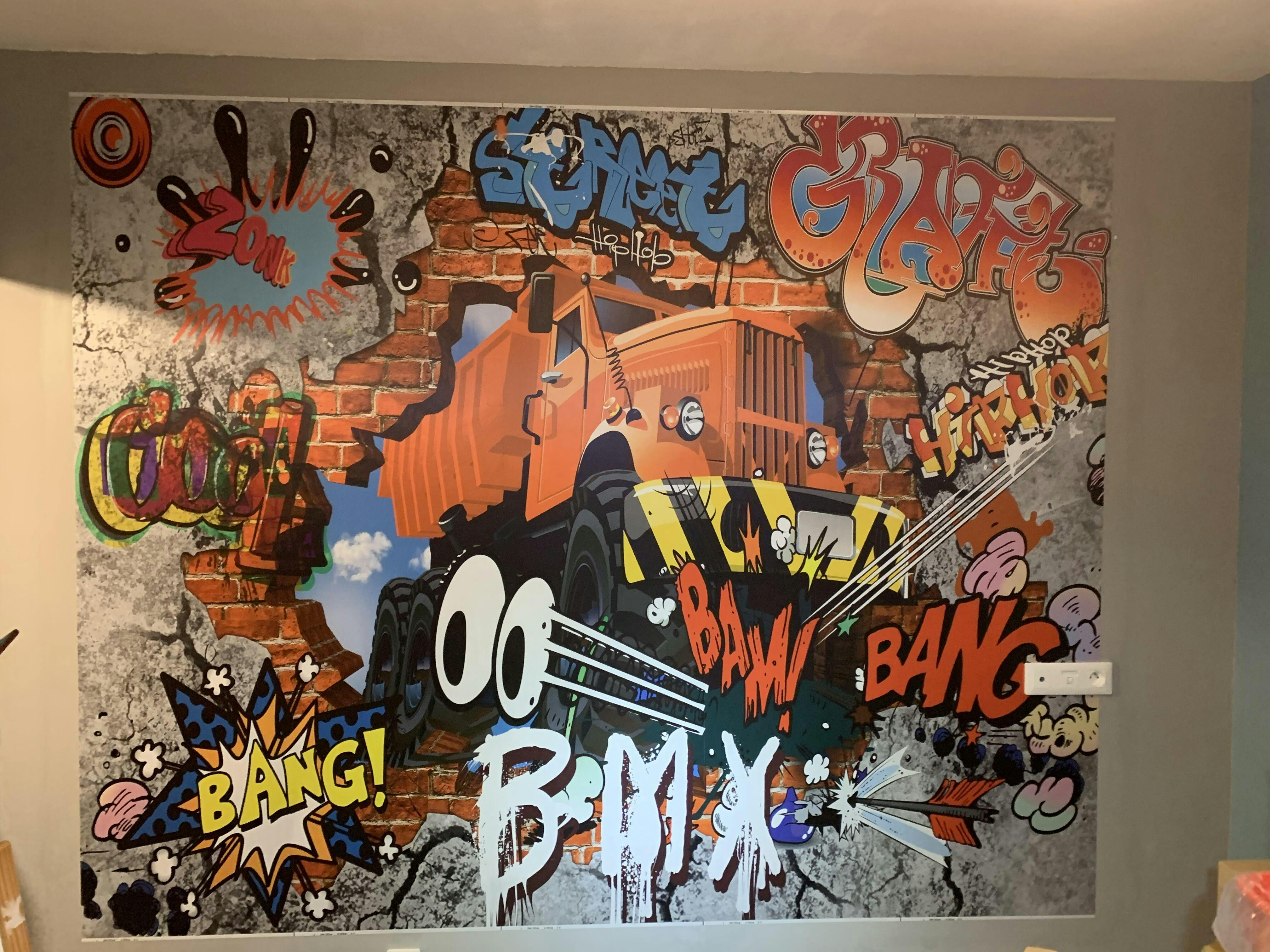
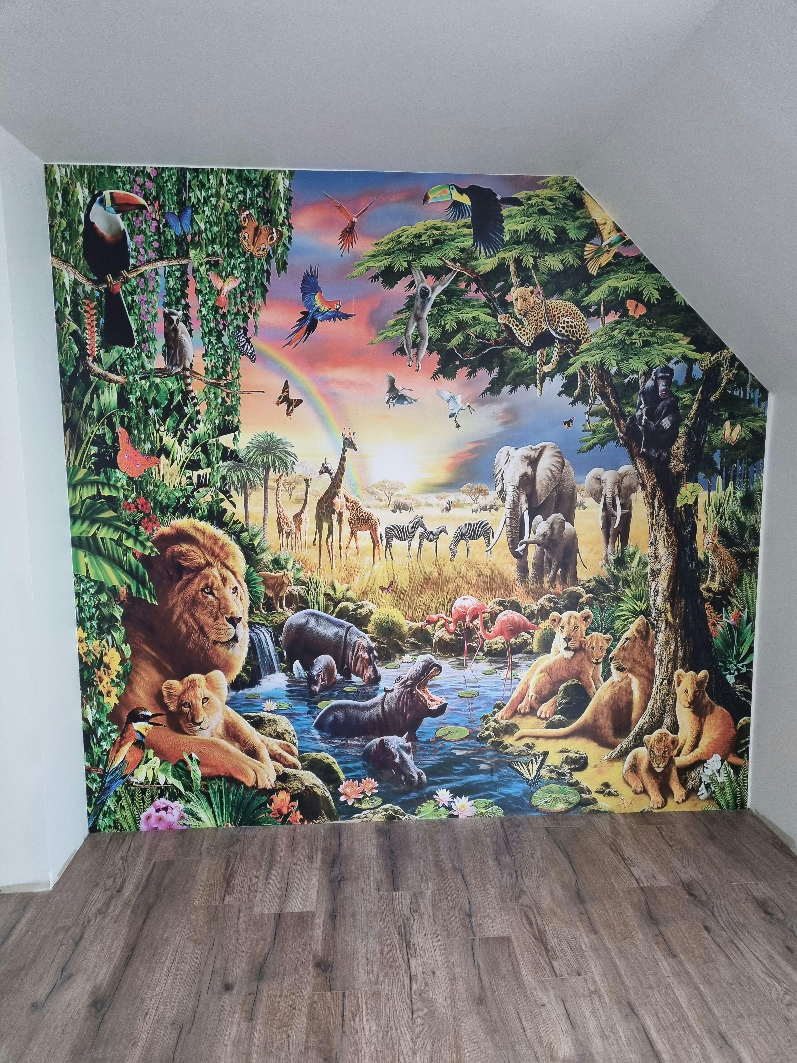
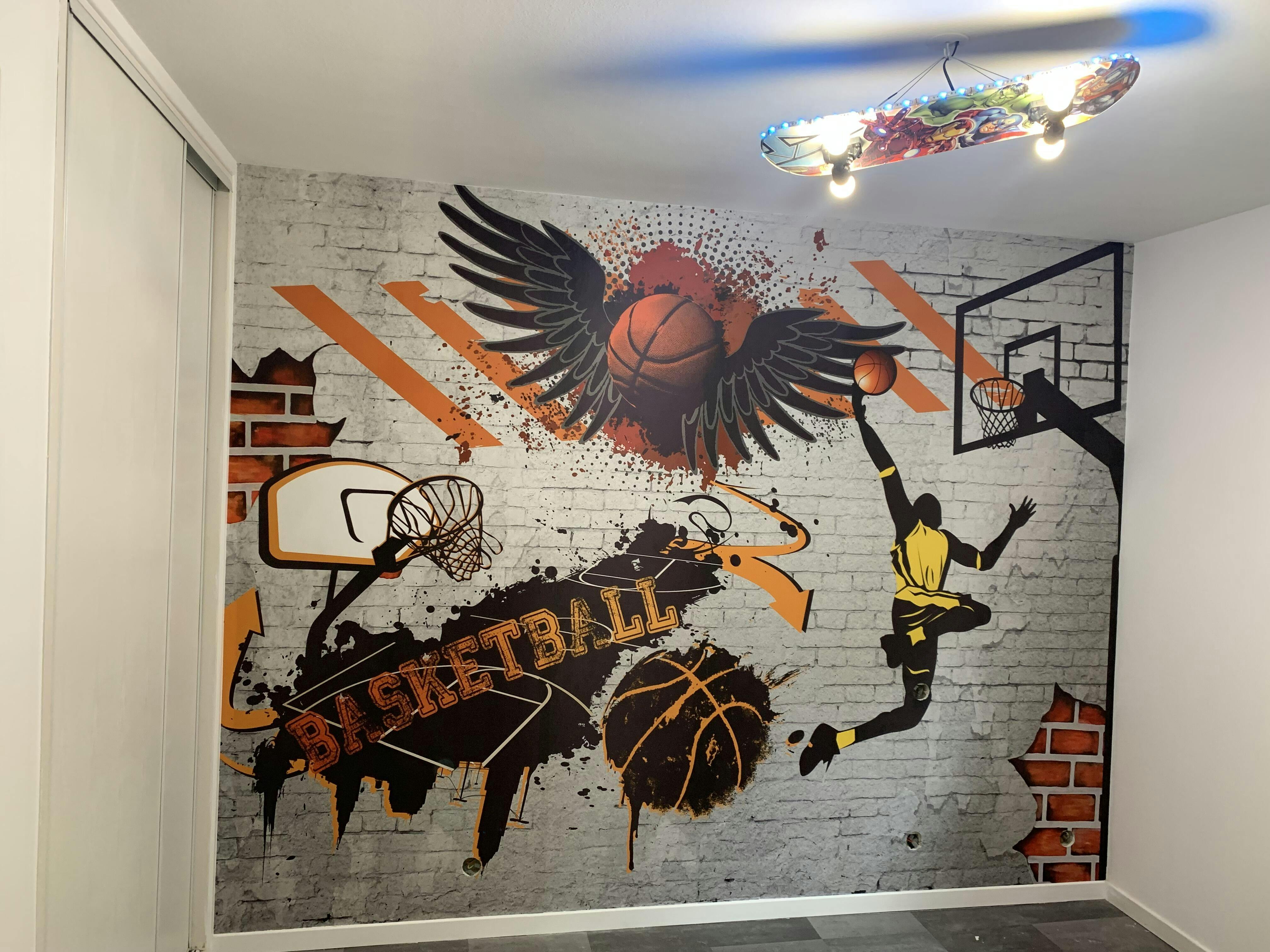
The Accent Wall: Dare to be Different
The accent wall is the little touch of madness that makes all the difference. Imagine a wall of floral wallpaper in a child's bedroom, for example. It's your time to shine! Here's how to do it:
- Choose the wall : Go for the one that catches the eye first.
- Select a pattern which contrasts with the rest of the room.
- Apply the paper and admire the result!
In short, whether you choose vertical installation, horizontal division or accent wall, the important thing is to have fun and let your creativity speak. And don't forget, a little floral wallpaper can transform any room into a cheerful and welcoming space!
Mistakes to Absolutely Avoid
Do Not Overload the Room
When we decorate, we often want to put everything forward. But be careful, too many colors kill the color! We advise you not to use more than three colors in a single room. Otherwise, chaos is guaranteed! Here are some tips:
- Choose colors that complement each other.
- Use shades of the same color for a harmonious effect.
- Think about the balance between light and dark colors.
Avoid Bright Colors
We all have a friend who loves neon, but that's no reason to do the same at home! Overly bright colors can quickly become tiring. Here's what we recommend:
- Opt for softer shades.
- Add small touches of bright color, such as cushions or paintings.
- Test colors on a small sample before committing.
Don't Forget Lighting
Lighting can transform a room. If you choose colors without thinking about lighting, you may end up with a disappointing result. Here are some tips:
- Test your colors at different times of the day.
- Think about the light source: natural or artificial?
- Use lamps with warm light bulbs to soften the hues.
By avoiding these mistakes, we can all create an interior that suits us and is pleasant to live in!
Inspiration: Ideas for Combinations That Are a Hit
The Black and White Duo: Chic and Timeless
Ah, black and white is a bit like bread and butter, it never goes out of style! It can be used anywhere : in the living room, the bedroom, even in the toilets (yes, yes, we swear). Plus, it gives an elegant and modern look to any room.
Pastel Tones: Softness and Elegance
Pastel tones are like eye candy. Imagine a sky blue wall paired with a pale pink. It’s soft, it’s fresh, and it makes you want to curl up with a good book. You can even add touches of white to make it pop.
Bright Colors: For Adventurers
For those who like to take risks, why not dare to use bright colours? A orange wallpaper can bring a vibrant and upbeat vibe to a room. It pairs well with colors like blue, yellow, and black, allowing for bold or harmonious combinations. Popular shades include burnt orange, which offers warmth and sophistication, and orange apricot, which brings softness and naturalness.
Popular Combinations Table
| Main Color | Associated Colors |
|---|---|
| Black | White, Grey |
| Blue | Pink, Yellow |
| Orange | Blue, Yellow, Black |
| Green | Beige, White |
| Red | Black, White |
In Summary
So, ready to play with colors? Whether you're more classic with black and white, soft with pastels, or bold with bright colors, there's a combination waiting for you. Have fun and let your creativity run wild!
How to Choose the Right Wallpaper for Your Space

Consider Room Size
When choosing wallpaper, the size of the room is super important. We don't want our living room to look like a nightclub! Here are some tips:
- In small rooms, opt for light patterns and light colors.
- For larger rooms, you can have fun with bolder patterns, but be careful not to overload!
- Think balance: An accent wall can work wonders.
Matching Wallpaper to Your Furniture
It is crucial that the wallpaper matches your furniture. Here's how to do it:
- Look at the colors of your furniture. Choose wallpapers that complement them.
- If you have wooden furniture, wallpaper with natural patterns can be a good choice.
- Avoid colours that clash too much with your furniture, otherwise it will look messy!
Think about Maintenance and Durability
We don't want to spend our time cleaning, do we? Here are some tips:
- Choose washable wallpapers for easy maintenance.
- Check the durability: a good wallpaper must withstand the hazards of everyday life.
- Think eco-responsible: opt for sustainable materials that respect the environment.
Pro Tips for a Stylish Interior
Playing with Textures
When decorating, you shouldn't just think about colors, but also textures! Mixing different textures can really add some zest to your interior. For example :
- Soft fabrics like velvet for cushions
- Raw materials like wood or metal for furniture
- Natural elements like plants or wicker baskets
Using Patterns Wisely
Patterns are like spices in a dish: you shouldn't overdo it! Here are some tips:
- Choose a strong pattern for an accent wall.
- Mix patterns but stay in the same color palette.
- Avoid overloading the room with too many different patterns.
Create Demarcated Living Areas
For a stylish interior, it is important to delimit spaces. Here's how to do it:
- Use rugs to define areas.
- Place furniture to create invisible “walls.”
- Play with lighting to highlight each area.
By following these tips, you'll be on your way to an interior that makes a splash!
Conclusion: The Magic of Colors!
There you have it, you’re now a two-tone wallpaper pro! Who knew playing with colors could be so much fun? By skillfully mixing your wallpapers, you can transform any room into a killer space. Remember, the key is to keep a balance: not too many colors, not too many patterns, just enough to make your walls tell a story without making a fuss. So, get your rollers out, and may the creativity be with you!
Frequently Asked Questions
How do I choose colors for my wallpaper?
When choosing colors, think about what works well together. Complementary colors, like blue and orange, can create a nice contrast.
Can we mix different patterns?
Yes, but the patterns should complement each other. For example, pair a floral pattern with a striped pattern, but make sure they share similar colors.
How to avoid making a room too dark?
To avoid this, use light colors on the walls facing the windows. This helps reflect light and makes the room brighter.
Which installation technique is the simplest?
Vertical installation is often the easiest, as it helps give the illusion of a higher ceiling.
How to maintain wallpaper?
Most modern wallpapers are washable. A simple wipe with a sponge is enough to remove stains.
Is the wallpaper durable?
Yes, a good wallpaper is designed to last a long time and withstand daily wear and tear.